P&G
Role
Product Designer
Team
Stella Lim, Rashi Kanungo, Gianna Maihofer,
Avery Kruppe, Natalie Newton, Caitlyn Hagen,
Chanseo Shin, Hannah Ahn, Avery Dellinger
Duration
Jan - May 2024
Tools
Figma
Miro
Brief
Redesigning the Gillette Storefront on Amazon.
Redesigned Gillette's Amazon storefront to enhance brand visibility and streamline product discovery through a more personalized and intuitive shopping experience. The updated design aimed to engage both new and returning customers by making it easier to explore, learn about, and find the right grooming products.
My Contribution
I led the design of a personalized grooming quiz that delivers tailored product recommendations. Through user interviews, I uncovered key pain points and turned those insights into high-fidelity prototypes. I also ran usability tests to validate decisions and refine the flow into an engaging shopping experience.
Problem
P&G has seen lower than expected sales for its beauty products on Amazon.

Goal
Increase sales of P&G beauty products on Amazon by improving product discovery and supporting informed product selection.
Competitive
Analysis
Leading storefronts simplify layouts, guide selection, personalize recommendations, and highlight deals.
This activity aimed to assess P&G"s Amazon grooming storefronts, Gillette and Braun, through a competitive analysis of leading storefronts. By identifying key strengths, weaknesses, and best practices in storefront design, we uncovered opportunities to inform the redesign of the P&G grooming experience.

Findings
Competitive analysis highlighted clear gaps in the current experience, directly guiding our redesign priorities.
Simple Layouts
Clean design, not overly cluttered with text and image.
Product Pages
Helping users easily find the right products for them.
Recommendations
"Recommended for you" section that is personalized.
Deals & Bundles
Highlighting and promoting deals for trade-up.
User Interviews
Shoppers want faster discovery, more personalization, and clearer seller trust signals.
Conducted 11 interviews with users aged 20-30 who intend to purchase grooming products on Amazon.
Our goals were to:
Understand users' current experience purchasing grooming products on Amazon mobile.
Explore shopper decision factors influencing purchases.
Identify pain points and opportunities within the Amazon platform.


Findings
Positive Remarks
Amazon's helpful search filters and product recommendation sections enhance product visibility.
Users appreciate quick product discovery, free shipping, and fast delivery.
Pain points
Users are unaware of third-party sellers, leading to concerns about product reliability.
Cart abandonment occurs when prices changes or products are deemed unnecessary.
Opportunities
Improving the search filters to provide more of a personalized experience.
Allow collapsing and expanding of information to reduce scrolling.
Increase the visibility of seller legitimacy and verification.
Prioritization
Matrix
Prioritized high impact features that improve discovery, purchase decision, and trade-up behavior.
Used a prioritization matrix to identify key features based on user interviews and stakeholder feedback. Each feature were evaluated by its potential to improve product discovery, drive purchase, and encourage trade-ups. This helped focus on what mattered most to both shoppers and the brand.

Insights
The matrix highlighted high impact features for shoppers and stakeholders.
Personalized Quizzes
Tailored quizzes help users find the right products faster, enhancing relevance and engagement.
Minimized Scroll Fatigue
Reducing excessive scrolling helps shopper browse products without feeling overwhelmed.
Improve Storefront Visibility
Boosting storefront discoverability increase user access and brand exposure.
Smart Product Recommendations
Relevant in-store suggestions guide users toward better product choices and boost conversions.
Ideation
Visualizing the storefront.
With a clear set of priorities, the storefront components were visualized through ideation and sketching. Goals for our grooming storefront involved helping explorer shoppers and beginner shavers:
Easily discover new products.
Become educated about the right product or routine for them
Receive personalized recommendations.
Decide on the right product.


Discover
Learn
Find Your Fit
Initial Prototype
Building an MVP.
For the MVP, key elements from the sketches were brought into the design. To reinvent the storefront, most components were designed from scratch, including the tabs (Discover, Find Your Fit, Learn), banners, product categories, and the grooming quiz.

Usability Testing
Users found the quiz helpful, but noted layout and content gaps.
Conducted usability tests with three participants who had personal grooming experience. They were given specific navigation tasks to complete within our prototype, such as locating key features and completing specific flows.
Findings
Positive Feedback
User #1
"Comparison charts and grooming quiz are very helpful."
"I really like the personalized quiz as it's straightforward and questions were relevant."
User #2
User #3
"I find the information on the learn tab really useful."
Constructive Feedback
User #2
"Maybe adding information about how to deal with cuts and how to do aftercare or beard maintenance."
"The tabs need more color and the header feels too big and overwhelming."
User #3
Iterations
Refining the Gillette storefront.
Based on usability testing feedback, the prototype was iterated to address pain points and improve usability.

Discover
Instead of using a “See All” option, the header was condensed by removing it and resizing product categories for better accessibility and efficiency.
Tabs
The tabs were initially white and gray, blending into the background and making them hard to see. To improve visibility, we color-coded them in green, orange, and blue, matching each color to its section.
Final Design
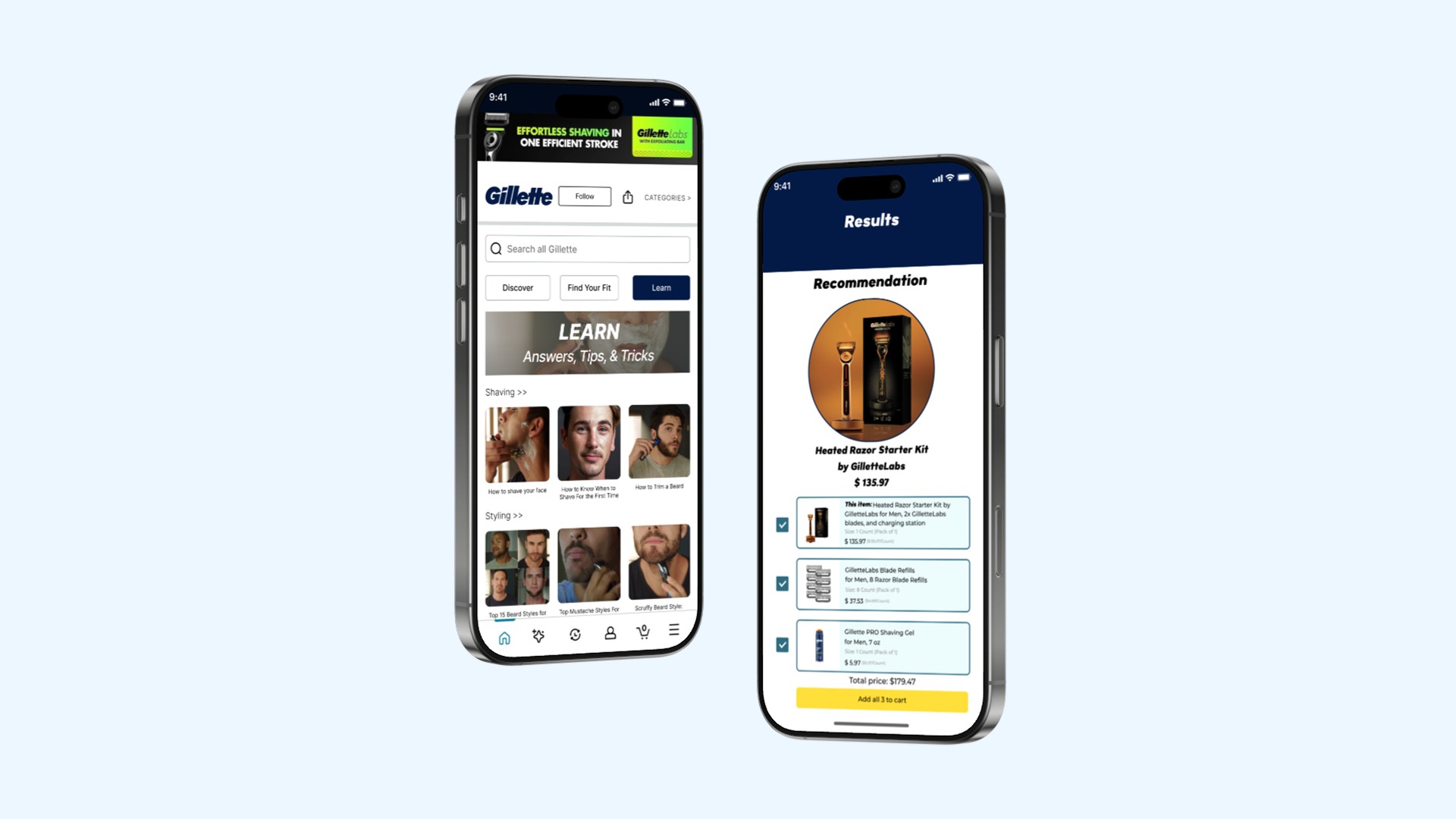
Reimagining Gillette's shopping experience on Amazon mobile.
Discover
A curated section that encourages exploration with featured products and categories.

Find Your Fit
Helps users narrow down grooming tools based on personal needs and habits.
Learn
Provide tips, how-to guides, and product education to support decisions.

Reflection
What I learned.
Balancing user needs and business goals
This project helped me understand how to design with both the user and the business in mind. By focusing on features like personalization and product discovery, I saw how good design can create a smoother experience for users and drive real impact like better engagement and more confident purchases.
Communicating design rationale
Explaining my design choices to stakeholders pushed me to become clearer and more intentional with how I communicated. I learned how to break down my thinking in a way that made sense to others and how to adapt when priorities shifted while advocating for the user.
P&G
Role
Product Designer
Team
Stella Lim
Rashi Kanungo
Gianna Maihofer
Avery Kruppe
Natalie Newton
Caitlyn Hagen
Chanseo Shin
Hannah Ahn
Aver Dellinger
Duration
Jan - May 2024
Tools
Figma
Miro
Brief
Redesigning the Gillette Storefront on Amazon.
Redesigned Gillette's Amazon storefront to enhance brand visibility and streamline product discovery through a more personalized and intuitive shopping experience. The updated design aimed to engage both new and returning customers by making it easier to explore, learn about, and find the right grooming products.
My Contribution
I led the design of a personalized grooming quiz that delivers tailored product recommendations. Through user interviews, I uncovered key pain points and turned those insights into high-fidelity prototypes. I also ran usability tests to validate decisions and refine the flow into an engaging shopping experience.
Problem
P&G has seen lower than expected sales for its beauty products on Amazon.
Goal
Increase sales of P&G beauty products on Amazon by improving product discovery and supporting informed product selection.
Competitive Analysis
Leading storefronts simplify layouts, guide selection, personalize recommendations, and highlight deals.
This activity aimed to assess P&G"s Amazon grooming storefronts, Gillette and Braun, through a competitive analysis of leading storefronts. By identifying key strengths, weaknesses, and best practices in storefront design, we uncovered opportunities to inform the redesign of the P&G grooming experience.
Findings
Competitive analysis highlighted clear gaps in the current experience, directly guiding our redesign priorities.
Simple Layouts
Clean design, not overly cluttered with text and image.
Product Pages
Helping users easily find the right products for them.
Recommendations
"Recommended for you" section that is personalized.
Deals & Bundles
Highlighting and promoting deals for trade-up.
User Interviews
Shoppers want faster discovery, more personalization, and clearer seller trust signals.
Conducted 11 interviews with users aged 20-30 who intend to purchase grooming products on Amazon.
Our goals were to:
Understand users' current experience purchasing grooming products on Amazon mobile.
Explore shopper decision factors influencing purchases.
Identify pain points and opportunities within the Amazon platform.
Findings
Positive Remarks
Amazon's helpful search filters and product recommendation sections enhance product visibility.
Users appreciate quick product discovery, free shipping, and fast delivery.
Pain points
Users are unaware of third-party sellers, leading to concerns about product reliability.
Cart abandonment occurs when prices changes or products are deemed unnecessary.
Opportunities
Improving the search filters to provide more of a personalized experience.
Allow collapsing and expanding of information to reduce scrolling.
Increase the visibility of seller legitimacy and verification.
Prioritization Matrix
Prioritized high impact features that improve discovery, purchase decision, and trade-up behavior.
Used a prioritization matrix to identify key features based on user interviews and stakeholder feedback. Each feature were evaluated by its potential to improve product discovery, drive purchase, and encourage trade-ups. This helped focus on what mattered most to both shoppers and the brand.
Insights
The matrix highlighted high impact features for shoppers and stakeholders.
Personalized Quizzes
Tailored quizzes help users find the right products faster, enhancing relevance and engagement.
Minimized Scroll Fatigue
Reducing excessive scrolling helps shopper browse products without feeling overwhelmed.
Improve Storefront Visibility
Boosting storefront discoverability increase user access and brand exposure.
Smart Product Recommendations
Relevant in-store suggestions guide users toward better product choices and boost conversions.
Initial Prototype
Building an MVP.
For the MVP, key elements from the sketches were brought into the design. To reinvent the storefront, most components were designed from scratch, including the tabs (Discover, Find Your Fit, Learn), banners, product categories, and the grooming quiz.
Ideation
Visualizing the storefront.
With a clear set of priorities, the storefront components were visualized through ideation and sketching. Goals for our grooming storefront involved helping explorer shoppers and beginner shavers:
Easily discover new products.
Become educated about the right product or routine for them
Receive personalized recommendations.
Decide on the right product.
Discover
Learn
Find Your Fit
Reflection
What I learned.
Balancing user needs and business goals
This project helped me understand how to design with both the user and the business in mind. By focusing on features like personalization and product discovery, I saw how good design can create a smoother experience for users and drive real impact like better engagement and more confident purchases.
Communicating design rationale
Explaining my design choices to stakeholders pushed me to become clearer and more intentional with how I communicated. I learned how to break down my thinking in a way that made sense to others and how to adapt when priorities shifted while advocating for the user.
Jump to final design
Usability Testing
Users found the quiz helpful, but noted layout and content gaps.
Conducted usability tests with three participants who had personal grooming experience. They were given specific navigation tasks to complete within our prototype, such as locating key features and completing specific flows.
Findings
Positive Feedback
User #1
"Comparison charts and grooming quiz are very helpful."
"I really like the personalized quiz as it's straightforward and questions were relevant."
User #2
User #3
"I find the information on the learn tab really useful."
Constructive Feedback
User #2
"Maybe adding information about how to deal with cuts and how to do aftercare or beard maintenance."
"The tabs need more color and the header feels too big and overwhelming."
User #3
Iterations
Refining the Gillette storefront.
Based on usability testing feedback, the prototype was iterated to address pain points and improve usability.
Discover
Instead of using a “See All” option, the header was condensed by removing it and resizing product categories for better accessibility and efficiency.
Tabs
The tabs were initially white and gray, blending into the background and making them hard to see. To improve visibility, we color-coded them in green, orange, and blue, matching each color to its section.
Final Design
Reimagining Gillette's shopping experience on Amazon mobile.
A curated section that encourages exploration with featured products and categories.
Discover
Learn
Find Your Fit
Helps users narrow down grooming tools based on personal needs and habits.
Provide tips, how-to guides, and product education to support decisions.
P&G
Brief
Redesigning the Gillette Storefront on Amazon.
Redesigned Gillette's Amazon storefront to enhance brand visibility and streamline product discovery through a more personalized and intuitive shopping experience. The updated design aimed to engage both new and returning customers by making it easier to explore, learn about, and find the right grooming products.
My Contribution
I led the design of a personalized grooming quiz that delivers tailored product recommendations. Through user interviews, I uncovered key pain points and turned those insights into high-fidelity prototypes. I also ran usability tests to validate decisions and refine the flow into an engaging shopping experience.
Problem
P&G has seen lower than expected sales for its beauty products on Amazon.
Goal
Increase sales of P&G beauty products on Amazon by improving product discovery and supporting informed product selection.
Competitive Analysis
Leading storefronts simplify layouts, guide selection, personalize recommendations, and highlight deals.
This activity aimed to assess P&G"s Amazon grooming storefronts, Gillette and Braun, through a competitive analysis of leading storefronts. By identifying key strengths, weaknesses, and best practices in storefront design, we uncovered opportunities to inform the redesign of the P&G grooming experience.
Findings
Competitive analysis highlighted clear gaps in the current experience, directly guiding our redesign priorities.
Simple Layouts
Clean design, not overly cluttered with text and image.
Product Pages
Helping users easily find the right products for them.
Recommendations
"Recommended for you" section that is personalized.
Deals & Bundles
Highlighting and promoting deals for trade-up.
User Interviews
Shoppers want faster discovery, more personalization, and clearer seller trust signals.
Conducted 11 interviews with users aged 20-30 who intend to purchase grooming products on Amazon.
Our goals were to:
Understand users' current experience purchasing grooming products on Amazon mobile.
Explore shopper decision factors influencing purchases.
Identify pain points and opportunities within the Amazon platform.
Findings
Positive Remarks
Amazon's helpful search filters and product recommendation sections enhance product visibility.
Users appreciate quick product discovery, free shipping, and fast delivery.
Pain Points
Users are unaware of third-party sellers, leading to concerns about product reliability.
Cart abandonment occurs when prices changes or products are deemed unnecessary.
Opportunities
Improving the search filters to provide more of a personalized experience.
Allow collapsing and expanding of information to reduce scrolling.
Increase the visibility of seller legitimacy and verification.
Prioritization Matrix
Prioritized high impact features that improve discovery, purchase decision, and trade-up behavior.
Used a prioritization matrix to identify key features based on user interviews and stakeholder feedback. Each feature were evaluated by its potential to improve product discovery, drive purchase, and encourage trade-ups. This helped focus on what mattered most to both shoppers and the brand.
Insights
The matrix highlighted high impact features for shoppers and stakeholders.
Personalized Quizzes
Tailored quizzes help users find the right products faster, enhancing relevance and engagement.
Minimized Scroll Fatigue
Reducing excessive scrolling helps shopper browse products without feeling overwhelmed.
Improve Storefront Visibility
Boosting storefront discoverability increase user access and brand exposure.
Smart Product Recommendations
Relevant in-store suggestions guide users toward better product choices and boost conversions.
Ideation
Visualizing the storefront.
With a clear set of priorities, the storefront components were visualized through ideation and sketching. Goals for our grooming storefront involved helping explorer shoppers and beginner shavers:
Easily discover new products.
Become educated about the right product or routine for them
Receive personalized recommendations.
Decide on the right product.
Discover
Learn
Find Your Fit
Design System

Final Product
Building an MVP.
For the MVP, key elements from the sketches were brought into the design. To reinvent the storefront, most components were designed from scratch, including the tabs (Discover, Find Your Fit, Learn), banners, product categories, and the grooming quiz.
Reflection
What I learned.
Balancing user needs and business goals
This project helped me understand how to design with both the user and the business in mind. By focusing on features like personalization and product discovery, I saw how good design can create a smoother experience for users and drive real impact like better engagement and more confident purchases.
Communicating design rationale
Explaining my design choices to stakeholders pushed me to become clearer and more intentional with how I communicated. I learned how to break down my thinking in a way that made sense to others and how to adapt when priorities shifted while advocating for the user.
Role
Product Designer
Team
Stella Lim
Rashi Kanungo
Gianna Maihofer
Avery Kruppe
Natalie Newton
Caitlyn Hagen
Chanseo Shin
Hannah Ahn
Aver Dellinger
Duration
Jan - May 2024
Tools
Figma
Miro
Jump to final design
Usability Testing
Users found the quiz helpful, but noted layout and content gaps.
Conducted usability tests with three participants who had personal grooming experience. They were given specific navigation tasks to complete within our prototype, such as locating key features and completing specific flows.
Findings
Positive Feedback
User #1
"Comparison charts and grooming quiz are very helpful."
"I really like the personalized quiz as it's straightforward and questions were relevant."
User #2
User #3
"I find the information on the learn tab really useful."
Constructive Feedback
User #2
"Maybe adding information about how to deal with cuts and how to do aftercare or beard maintenance."
"The tabs need more color and the header feels too big and overwhelming."
User #3
Iterations
Refining the Gillette storefront.
Based on usability testing feedback, the prototype was iterated to address pain points and improve usability.
Discover
Tabs
Instead of using a “See All” option, the header was condensed by removing it and resizing product categories for better accessibility and efficiency.
The tabs were initially white and gray, blending into the background and making them hard to see. To improve visibility, we color-coded them in green, orange, and blue, matching each color to its section.
Final Design
Reimagining Gillette's shopping experience on Amazon mobile.
A curated section that encourages exploration with featured products and categories.
Discover
Learn
Find Your Fit
Helps users narrow down grooming tools based on personal needs and habits.
Provide tips, how-to guides, and product education to support decisions.