Cample
Role
Product Designer
Team
Stella Lim, Hope Jang,
Daniel Kang, Abby Choi, Jay Kwon,
Joshua Paik, Yechan Choi
Stella Lim
Hope Jang
Daniel Kang
Abby Choi
Jay Kwon,
Joshua Paik
Yechan Choi
Duration
April 2024 - July 2025
Tools
Figma
Brief
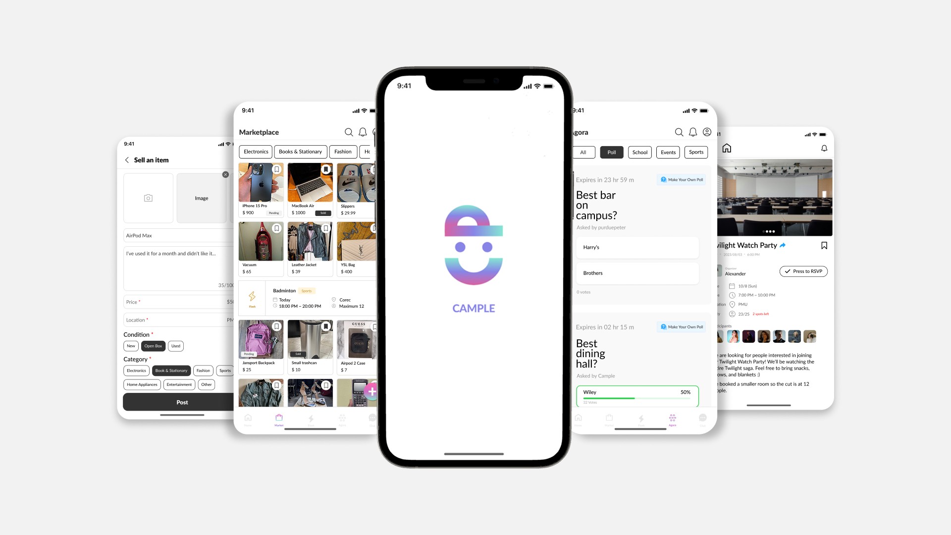
Campus marketplace and social hub for college students.
Cample is a campus app that helps college students buy and sell second-hand items and connect with others. Students can find great deals, share activities, and organize group events that bring the campus community closer together.
My Contribution
I joined midway to polish the product into a refined experience.
I joined midway to transform the existing UI into a high-fidelity design. My role involved conducting competitive analysis, iterating on designs, running usability and A/B tests, refining the interface based on feedback, and creating design system. I worked closely with front- and back-end developers to ensure smooth handoff and implementation.
Problem
The product lacked a design system, leading to inconsistent touchpoints that disrupted users' mental models.
Goal
Create a cohesive design system and a consistent high-fidelity interface that improves clarity across key flows.
Usability Testing
Observed users navigate the current design to uncover friction.
To better understand how the existing design worked in real use, I started with usability testing with 4 users across Marketplace, Flash, Agora, and Chat. I observed how they completed key tasks to uncover pain points, gather feedback, and prioritize UI improvements for the redesign.
Findings
Marketplace
User #1
"The term 'open box' is more suitable than 'almost new' when describing item condition in a marketplace."
"Some flows in marketplace feel incomplete and there's noticeable inconsistency in spacing and layout."
User #2
User #3
"Showing seller ratings and past sales could build trust."
Flash
User #1
"The flash layout feels overwhelming with too much text. Simplifying it would make navigation easier."
"The join button is easy to overlook ad the CTA can be misleading, making it unclear."
User #4
Agora
User #3
"The post creation page feels unorganized and unclear, making it harder to use."
"The design lacks differentiation and layout feels too similar to Flash, making Agora seem redundant."
User #2
Research
Clear navigation and CTAs were the biggest gaps to fix.
To shape a clearer and more consistent experience, I analyzed 4 second-hand marketplace (Karrot, OfferUp, Poshmark, Mercari) and 2 community platforms
(ZeeMee, Yee Yak) to find ways to improve usability and engagement.
I framed the research around two main questions:
How do leading apps structure navigation to align with user mental models?
How can we improve the design with features that better support user needs?
Key Insights
Based on findings from the competitive analysis, I identified key opportunities to improve Cample's design.
Smart Filters
Let users filter by price range and item condition to support more intentional browsing.
Product Transparency
Show view counts and contact stats to increase transparency and user confidence.
Community Bridge
Add Flash banners in marketplace to guide users naturally between shopping and community events.
Clear Navigation
Redesign the navigation to match users' natural browsing flow, reducing friction.
Ideation
Sketched design concepts based on user and research insights.
Using insights from usability testing and competitive analysis, I sketched multiple design directions to address key pain points in the existing experience. The focus was clearer layouts, stronger visual hierarchy, and smoother navigation across Marketplace, Flash, and Agora to better match user needs and expectations.


Design
Refinement
Design Refinement
Refined flows to align touchpoints into a cohesive experience.
Building on sketches, I refined the designs in Figma by fixing incomplete flows, layout inconsistencies, and missing touchpoints. At the same time, I created a design system to keep UI patterns consistent and make the overall experience feel more cohesive and usable.

Design System

Final Product
Marketplace
A campus marketplace for buying and selling secondhand items, with chat to arrange meetups and listing activity like views and buyer chat count.
Before
After


Flash
An events section to post and discover campus activities, RSVP, and join a group chat with other attendees.
Before
After


Final Product
Marketplace
A campus marketplace for buying and selling secondhand items, with chat to arrange meetups and listing activity like views and buyer chat count.
Before
After
Agora
A student forum for questions and updates, with daily polls to share quick opinions.
Before
After


Reflection
What I learned.
Growing as a Designer
Cample was my first year-long project outside of class and it taught me to adapt quickly, learn fast, and collaborate in an interdisciplinary team. I honed my figma skills, building interactive flows, and keeping files organized for developer handoff.
Communicating with Developers
Working with developers taught me how important clear and open communication was. I learned how to explain my design decisions, adapt when certain ideas weren't feasible, and stay aligned throughout the implementation process.
Importance of a Design System
The initial designs lacked consistency and direction. Without a structured system, collaboration felt messy and revisions were hard to mange. Introducing a unified system brought clarity to our workflow, created a consistent visual language, and made developer handoffs much efficient.
Jump to final design
Cample
Brief
Campus marketplace and social hub for college students.
Cample is a campus app that helps college students buy and sell second-hand items and connect with others. Students can find great deals, share activities, and organize group events that bring the campus community closer together.
My Contribution
I joined midway to polish the product into a refined experience.
I joined midway to transform the existing UI into a high-fidelity design. My role involved conducting competitive analysis, iterating on designs, running usability and A/B tests, refining the interface based on feedback, and creating design system. I worked closely with front- and back-end developers to ensure smooth handoff and implementation.
Problem
The product lacked a design system, leading to inconsistent touchpoints that disrupted users' mental models.
Goal
Create a cohesive design system and a consistent high-fidelity interface that improves clarity across key flows.
Jump to final design
Usability Testing
Observed users navigate the current design to uncover friction.
To better understand how the existing design worked in real use, I started with usability testing with 4 users across Marketplace, Flash, Agora, and Chat. I observed how they completed key tasks to uncover pain points, gather feedback, and prioritize UI improvements for the redesign.
Findings
Marketplace
User #1
"The term 'open box' is more suitable than 'almost new' when describing item condition in a marketplace."
"Some flows in marketplace feel incomplete and there's noticeable inconsistency in spacing and layout."
User #2
User #3
"Showing seller ratings and past sales could build trust."
Flash
User #1
"The flash layout feels overwhelming with too much text. Simplifying it would make navigation easier."
"The join button is easy to overlook ad the CTA can be misleading, making it unclear."
User #4
Agora
User #3
"The post creation page feels unorganized and unclear, making it harder to use."
"The design lacks differentiation and layout feels too similar to Flash, making Agora seem redundant."
User #2
Research
Clear navigation and CTAs were the biggest gaps to fix.
To shape a clearer and more consistent experience, I analyzed 4 second-hand marketplace (Karrot, OfferUp, Poshmark, Mercari) and 2 community platforms
(ZeeMee, Yee Yak) to find ways to improve usability and engagement.
I framed the research around two main questions:
How do leading apps structure navigation to align with user mental models?
How can we improve the design with features that better support user needs?
Key Insights
Based on findings from the competitive analysis, I identified key opportunities to improve Cample's design.
Smart Filters
Let users filter by price range and item condition to support more intentional browsing.
Product Transparency
Show view counts and contact stats to increase transparency and user confidence.
Community Bridge
Add Flash banners in marketplace to guide users naturally between shopping and community events.
Clear Navigation
Redesign the navigation to match users' natural browsing flow, reducing friction.
Ideation
Sketched design concepts based on user and research insights.
Using insights from usability testing and competitive analysis, I sketched multiple design directions to address key pain points in the existing experience. The focus was clearer layouts, stronger visual hierarchy, and smoother navigation across Marketplace, Flash, and Agora to better match user needs and expectations.
Design Refinement
Refined flows to align touchpoints into a cohesive experience.
Building on sketches, I refined the designs in Figma by fixing incomplete flows, layout inconsistencies, and missing touchpoints. At the same time, I created a design system to keep UI patterns consistent and make the overall experience feel more cohesive and usable.
Design System
Final Product
Marketplace
A campus marketplace for buying and selling secondhand items, with chat to arrange meetups and listing activity like views and buyer chat count.
Before
After
Flash
An events section to post and discover campus activities, RSVP, and join a group chat with other attendees.
Before
After
Agora
A student forum for questions and updates, with daily polls to share quick opinions.
Before
After
Reflection
What I learned.
Growing as a Designer
Cample was my first year-long project outside of class and it taught me to adapt quickly, learn fast, and collaborate in an interdisciplinary team. I honed my figma skills, building interactive flows, and keeping files organized for developer handoff.
Communicating with Developers
Working with developers taught me how important clear and open communication was. I learned how to explain my design decisions, adapt when certain ideas weren't feasible, and stay aligned throughout the implementation process.
Importance of a Design System
The initial designs lacked consistency and direction. Without a structured system, collaboration felt messy and revisions were hard to mange. Introducing a unified system brought clarity to our workflow, created a consistent visual language, and made developer handoffs much efficient.
Role
User Researcher
UI Design
Team
Stella Lim
Hope Jang
Daniel Kang
Abby Choi
Jay Kwon,
Joshua Paik
Yechan Choi
Duration
April 2024 - July 2025
Tools
Figma